
If you’re working in the world of SEO, you’ve seen an SEO dashboard.
But they’re usually cluttered with dozens (or even hundreds) of tools, features, and charts. How can we create dashboards that help instead of hurt?
Today, we’ll break down what matters most.
Let’s get started!
Editor’s note: This article comes from years of experience helping clients sell more using high-converting content. If you’re interested in more sales at your eCommerce store, send us a message.
Customize if possible
The first step to an SEO dashboard that works for you is to customize it as much as possible.
Whether you’re using a tool like Google Search Console or Ahrefs, a white label dashboard, or a completely custom system, you’ll run into a similar problem—data overload.
Oftentimes, you’ll have the option to include widgets or rearrange the way the dashboard is displayed. If that’s the case, create a single board that explains your most important metrics immediately.
What are the most important metrics? Glad you asked.
Choose your one metric that matters
In our previous article on eCommerce KPIs, we wrote to focus on the one metric that matters, or OMM. This single most important SEO metric will guide everything you do.
As you review any analytics or dashboards, be sure to focus on this number. It’ll help you ensure you’re focusing on the right things.
If you don’t have an OMM, then your first step is to choose one that will work to bring your store from its current place to where you’d like to be.
Use long-term vs. short-term focus for different kinds of metrics
When measuring how long SEO takes to work, it’s easy to confuse short-term and long-term results. Two of the best terms are “lagging indicators” that happen over a long period and “leading indicators” that happen in the short term.
As you set up your dashboard, it’s easy to get carried away with statistically insignificant results that can lead you to abandon your long-term strategy. Human psychology can be the biggest strength or weakness behind your efforts.
For example, here’s a real screenshot from the Google Analytics SEO dashboard. It shows a client’s organic traffic:
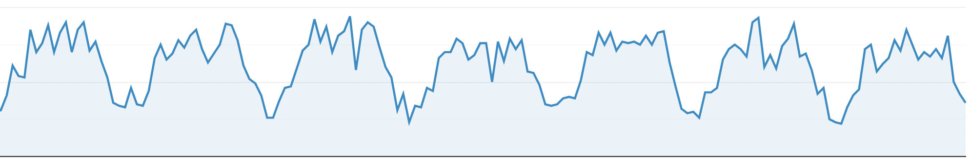
It doesn’t look like things are in very good shape. There are huge peaks and valleys, and the overall trend is downward.
If you saw this most times you logged into your SEO analytics, you’d get discouraged pretty fast.
But the problem becomes obvious if we look at the timeframe. The chart shows traffic on an hourly basis over the last week:
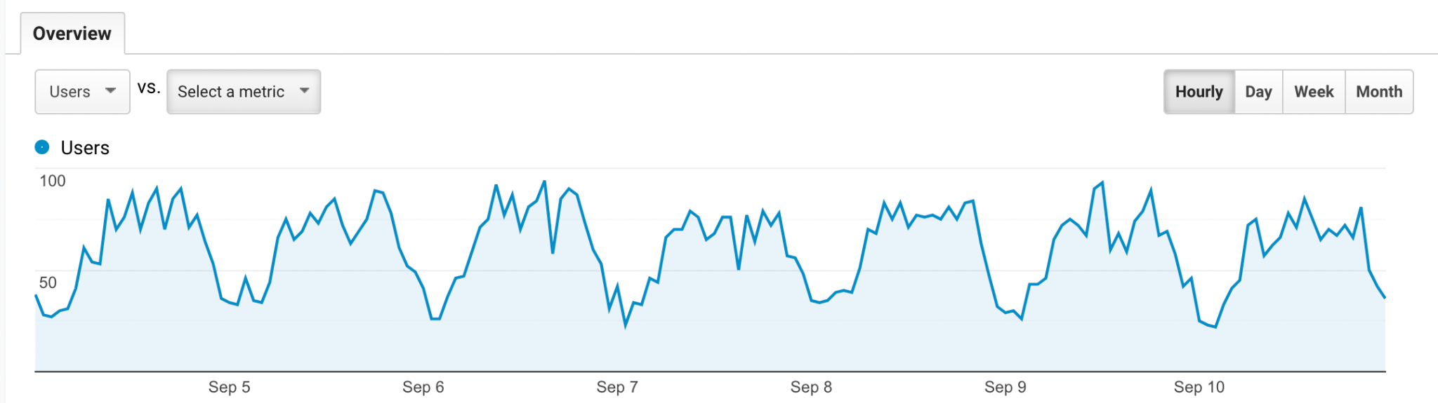
Of course it’ll be variable!
Now, let’s display the same data from the client’s Google Analytics account, but plotted daily over the last three months:
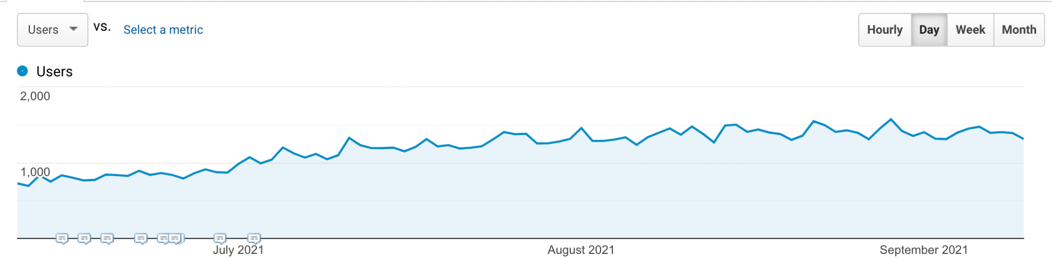
It’s obvious that the trend is upward, not downward. And the current slump is easy to explain with this extra data—traffic dips almost every Friday.
With the first chart, we might have considered throwing in the towel. But with the second, we can see things are doing well. And a Friday dip is almost expected—not something to worry about.
Extending the timeframe changes your perspective.
How to create an SEO dashboard that works
Dashboards are all about data analysis and visualization, and a better dashboard can make the difference between guiding an effective strategy and barreling ahead with an ineffective one.
But there’s another method that can help even more—bringing on someone else to help sort the signal from the noise.
An experienced team knows which metrics count, which don’t, and where you should put your efforts. And they can guide you not just to see the data but to understand it.
Looking for a partner to help you sort out a mass of SEO data? Talk to us.